
Critiquing Your Own Surface Pattern Designs: What to Look For & What to Fix
Imagine this: you’ve just put your pattern together, you let out a sigh of relief and think “I’m done”. Then, you look at it and something just feels off. At this point, you move things around, adjust colors, and adjust rotations, but this doesn’t help. This is when you need to learn how to critique your own work.
This post contains an affiliate link. If you make a purchase through my link, I may earn a commission at no cost to you.
In this blog, you’ll learn how to question why something isn’t working, identify it, and fix it.


There are four main things to look at when critiquing a pattern:
Composition & balance - basically checking if any area feels too full or too empty
Motif scale - are there clear large, medium and small motifs? Or do they all compete with each other?
Negative space - is it balanced within the pattern or are these big, empty areas?
Color & contrast - do the colors work together or do they compete with each other?
I encourage you to take notes using your pattern and patterns from other artists that you love. Looking at other people’s patterns, to LEARN from, can help you develop your critiquing skills.
When I was designing the pattern above, I had to look at the design as a whole multiple times to see that the spacing wasn’t quite right or a flower needed to be removed. I originally had designed it with the lighter background, and after looking at it on a mockup, I tried a charcoal background and I loved it. So, be flexible and adjust colors as needed. Which background color would you pick for the Snails in the Garden?
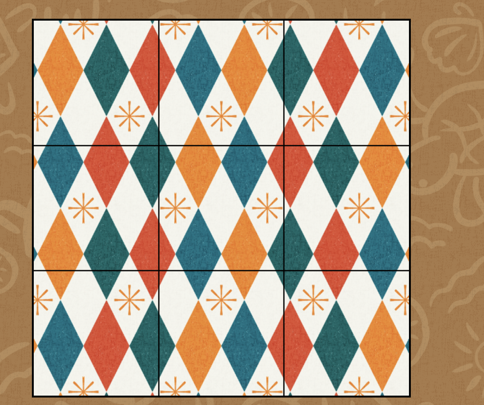
Check Your Repeat in Context
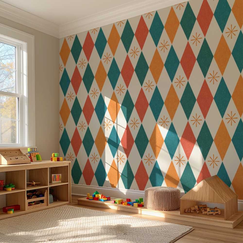
Looking at a tile of your pattern is one thing, but seeing it scaled down or on a mockup can make it look completely different. For a quick check, I like to use my free seamless pattern checker, which can show you your pattern tiled down. If you’d like a more detailed way to check your patterns and instantly see them on mockups, check out PatternPAL. In this program, you can drop you pattern it, have it analyzed, check seams, and see it on multiple mockups within minutes. I personally use PatternPal to check almost all my patterns for contrast and balance along with seeing them on my intended end-product.
Seeing your pattern scaled down allows you to notice if there any distractions or disruptions as your eyes move across the whole design.
You’ll also want to keep in mind your intended product, because your pattern can look fine in a pattern checker, but once you drop it on wallpaper or a notebook, it will look completely different.
Deciding What to Fix
This may be the most practical section, where you look at your notes & decide what to fix.
Pick your biggest issue (spacing, color, motif hierarchy), and fix it. I recommend just tackling one issue at a time so you can see how each change improves your design.
Remember! Not every area of too much negative space or low contrast design is “wrong”. Sometimes those decisions are intentional, and that’s perfectly fine. Minimalist, low contrast designs are great for wallpaper while dense, high contrast designs are great for smaller scale products like clothing, stationery, or blankets.
Conclusion: Build Your Own Critique Process
Just like creating patterns takes practice, so does developing art critiquing skills. Take the time to study your patterns (and other designs you admire) with intention, and before you know it, you’ll be making confident decisions when building patterns.
My challenge for you:
Choose one of your finished patterns
View it at thumbnail/tiled size & think about what you like and don’t like
Now, scale it down
Identify one thing that’s working and one thing that isn’t
If appropriate, make a small adjustment and see how the pattern looks afterwards.
